How do I make my small lettering look great with a true type font? My customer wants this font that is so thin that it just looks like a run stitch when I try to sew it out. What am I doing wrong? This is a question that I received from one of my students and I thought that I would answer it here in this newsletter.
I am going to use the font and the wording that my customer sent to me.  She could not make it look good and decided to ask me to do it for her. Here is the design and here is my answer to her.
As you can see the lettering is far too thin. To keep it simple you need to choose an embroidery font lettering style that is close to the customer‚’s logo, even though it may need to be edited a small amount in order for it to look like the customer’s logo. If you can avoid using a true type font for a situation like this, you are better off. It takes a lot of editing to make it look good, however, it can be done.
Your main issue here is that you have chosen the wrong font to begin with. You must educate your customer and convey to them that you are the professional when it comes to embroidery and you know what will work to make their logo look great and what will not work. What looks good in print does not always work great for embroidery.
There is one major rule that you must remember when you are creating your designs for small lettering. The columns of your lettering must be at least 1 millimeter wide. If you are working with tiny lettering, 4 millimeters high, you must be very careful about what font you choose. This goes for your embroidery fonts as well as true type fonts. This is the minimum measurement after you have added your pullcomp. Your column can be as narrow as .6 millimeters when you bring it in, but after you add your pull comp, it must measure 1 millimeter or it may look like a run stitch when it is sewing out because the column is just not wide enough to create a satin stitch.
To look at this in the right perspective, if you are using a 75/11 needle, the width of your needle as it penetrates into the fabric is .75 millimeters. If you stitch is not 1 millimeter wide you are only going to make a line or worse a hole in your fabric as the needle keeps going up and down in the same spot!
Another rule to remember is not to use a font that has rounded end caps. They do not sew out rounded. They just look messy. If you have chosen this type of font, you must edit it and straighten the ends. Rounded caps only work well if your letters are one inch or larger and you have the skill to create them round. It can definitely be done, I have done this many times, but for the very small lettering, it does not work out the way that you want it to.
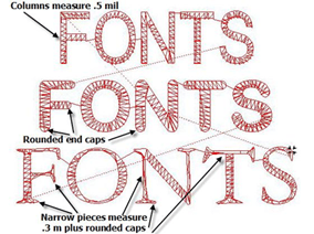
 The third font in the pictures below is too narrow and has rounded end caps also. This is definitely not a good font to use, however, this is the font that was sent to me by the embroiderer to use for the Longwood design. Their customer chose this font and insisted on using it so this is the font for the Longwood University design. This is the Garamond font.
I want you to see that it can be changed but it does take a lot of editing to make it sew out great!  When you have learned to edit enough to make a font like this sew out great on any type of fabric, you are ready for digitizing.
Try to use basic block fonts instead of fonts with serifs if at all possible. This will eliminate a lot of issues for you and give you a bolder cleaner look.
This is especially true if you are creating your lettering in a circle. This always works better if you are using a regular embroidery font rather than a true type font.
True type fonts always seem to have narrower columns to begin with and are sometimes tough when it comes to creating small lettering with them.
I have created a program that teaches you how to create designs using your embroidery fonts, true type fonts and shapes. It is available to all Gold members of the video training membership website, TheEmbroideryTrainingResourceCenter.com
In this program, I show you how to create 3 different type designs using basic shapes and lettering. I show you how to edit the true type font for the design, Longwood University. This is a great program to teach you how to edit and reshape letters to fit a customer‚’s logo lettering.
This is only one of our programs that is available inside of the membership website that teaches you how to create designs of higher quality for your customers. If you have not a member, click on the link and join today!
TheEmbroideryTrainingResourceCenter.com